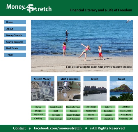
Description: Design a webpage home page using a grid
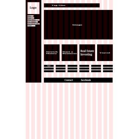
Process: I began by deciding on what idea I was going to create a web page for. I want to do a travel blog/website and also a money management website. I was not sure how to put them together into one. I started sketching some ideas and I realized that I could create one website all about me that has the travel and money management/investing in it. I then created a sitemap using the 16 column grid on Photoshop. My design stayed pretty close to the sitemap and I changed just a few things. I designed it using photoshop. I struggled with my color scheme a lot. I knew green was going to be in it and originally I had complementary red with it. I noticed my main picture had blue in it and felt my color scheme had to change.


Critique: I received a few critiques from our facebook page. A main idea I changed was to make my navigation buttons all the same size. I also got a great one on one critique from Helaman, a tutor from our class. He helped me change a lot from my original layout. A lot of it was stuff I knew needed changed. I removed a background that was distracting. I got rid of some color choices that made my website look old fashioned. Helaman made me realize I needed my navigation and footer bars to extend across the page. Helaman also liked the choice of blue on the background. He said it was calming which is appropriate for him when you are talking about money. My navigation buttons were greatly improved by removing a bevel and curve to my rectangles. There was a lot of insight during that meeting. My teacher critique helped me just narrow down the color scheme to two colors. I also changed to images on some of my content as suggested.
Message: Financial Literacy Education for a life of freedom
Audience: Anyone interested in learning financial literacy- how to save in all aspects of life including travel, invest, and start a business.
Top Thing Learned: I learned some very useful shortcuts on Photoshop like ctl T. Unifying elements was also a great lesson when I learned how to create a grid layout.
Color Scheme: Blue and green. Not quite part of any color scheme. I could have added teal to make analogous or brick for split complementary but it looked good simple with the blue and green.
Title Font: Adobe Gothic Std / San Serif
Body Font: Lucida Bright / Serif
Thumbnails of originals: All images are my own


Hey Nubia, I have really loved seeing your design evolve. It looks really great! I really like the colors that you chose and the changes that you made. Good job!
Check out this great design by Sylvia:
You can check out my Blog at: https://my2016designs.wordpress.com/2016/06/23/10a-web-page-mockup/
LikeLike
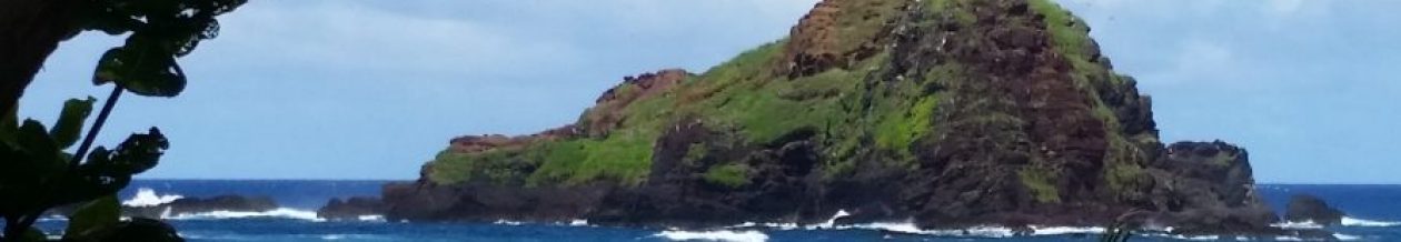
Nubia, I really like how your design was improving. It is hard to find the color scheme, but I think that the white background looks very good. The layout you chose match the whole page too. I still love the picture of the beach, it makes me have more desire to be there right now!! Great job!!
Check out Christopher:
http://comm130.hostyour.space/
and this is mine:
LikeLike